From upcycling to playing with your favorite green ink pad, this week we’re all about how good it is to be green. Whether you want to use something that would otherwise be garbage on a project and be inspired to be environmentally friendly, or if you want to play with the color we hope you’ll join us. I love combining mint green with navy blue, I also (of course) adore my Mowed Lawn distress products. What to choose? From frogs to leaves, olive to kelly - we look forward to seeing all things green this week.
Kicking things off for us this week we have a special guest-
Cheiron! She is a designer for Simon's
Wednesday challenge blog, and she creates some beautiful projects. Cheiron works in the financial district by day, and spends her nights relaxing at the craft table. She has been making cards since 2004, and has recently been exploring the world of mixed media.
 I love playing around with mixed media techniques and incorporating them into my card making, but this time I have created pages in an actual art journal. For this green challenge it was all about leaves for me. I used the Dyan Reavely Around the Edge stamp set which has great leaves and fun dots that I colored in with Faber Castell Pitt Artist Pens and paper pieced some of the leaves with stenciled papers from my stash. The background of the page is subtle, made by applying some glazing medium mixed with a bit of paint first in blue, and once dried with yellow.
Rather than using the green color,
Anita went green by upcycling an old window pane into a new organizational board for her last project her at Simon Says Stamp & Show.
 Yes stampers, sadly this is my last project at SSSS&S. I have thoroughly enjoyed my time here, and I thank the crew and DT for a most wonderful experience! I am going to miss it. I had a large (24x33) old window pane leaning against the wall in my garage for some time now, so with a little elbow grease, some reinforcing, and Ranger's Pearl Acrylic Paint Dabber it gleamed like new. After stamping on it, I filled the panes with Cork Sheet, Magnetic Paneling, wire mesh, and string to hang and attach tags and things I want to display in my work area. I will later add a shelf to the bottom of it when I have more time, but I am happy with how it came upcycled out!
Ashli's
Yes stampers, sadly this is my last project at SSSS&S. I have thoroughly enjoyed my time here, and I thank the crew and DT for a most wonderful experience! I am going to miss it. I had a large (24x33) old window pane leaning against the wall in my garage for some time now, so with a little elbow grease, some reinforcing, and Ranger's Pearl Acrylic Paint Dabber it gleamed like new. After stamping on it, I filled the panes with Cork Sheet, Magnetic Paneling, wire mesh, and string to hang and attach tags and things I want to display in my work area. I will later add a shelf to the bottom of it when I have more time, but I am happy with how it came upcycled out!
Ashli's project started out as just some simple creative play. One thing lead to another and she ended up with a fun little décor piece!
 When I started this, I had no idea where it would end up. Sometimes that is the best way to create! I began by simply playing with a favorite stencil from The Crafter's Workshop and some Green mists on a few oversized tags. When I had three finished tags, I loved them so much that I decided to turn them into an art piece! And since we are all about green this week, I up-cycled a scrap piece of white paper and leftover piece of plywood. With all my tags mounted, I headed to my embellishment drawer. Once I found that adorable house from the American Crafts Mayberry line, I knew the direction to take this tag art in! Home Sweet Home - complete with the date we purchased our house. I love it when a little session of creative play leads to an unexpected and fun finished art piece!
This week I (
May) went leaf-y with the challenge.

Like Cheiron, I heard green challenge and grabbed for my beloved
Dylusions leaf stamps! I had a lot of creative fun making this tag and layering both stamps and colors as I created so much leafy (green) goodness. Combined with my favorite Dylusions
flower stamp, as well as some
summer distress to make my background I've now got a tag ready to place on a birthday package for someone special.
Meihsia chose yellowish-green to interpret her outdoor themed layout this week.
 My daughter Natalie loves outdoor activities a lot so on this layout I used a photo of her and two of her favorite colors - blue and green. The background of this layout was colored using Ranger Adirondack Paint Dabber LETTUCE and stamped with Clearsnap ColorBox pigment ink and Versafine Onyx Black. I made a zipper flower and had some machine sewing stitches to decorate this page. The beautiful green on this layout reminds us of the great time we had in Austin.
Suzz
My daughter Natalie loves outdoor activities a lot so on this layout I used a photo of her and two of her favorite colors - blue and green. The background of this layout was colored using Ranger Adirondack Paint Dabber LETTUCE and stamped with Clearsnap ColorBox pigment ink and Versafine Onyx Black. I made a zipper flower and had some machine sewing stitches to decorate this page. The beautiful green on this layout reminds us of the great time we had in Austin.
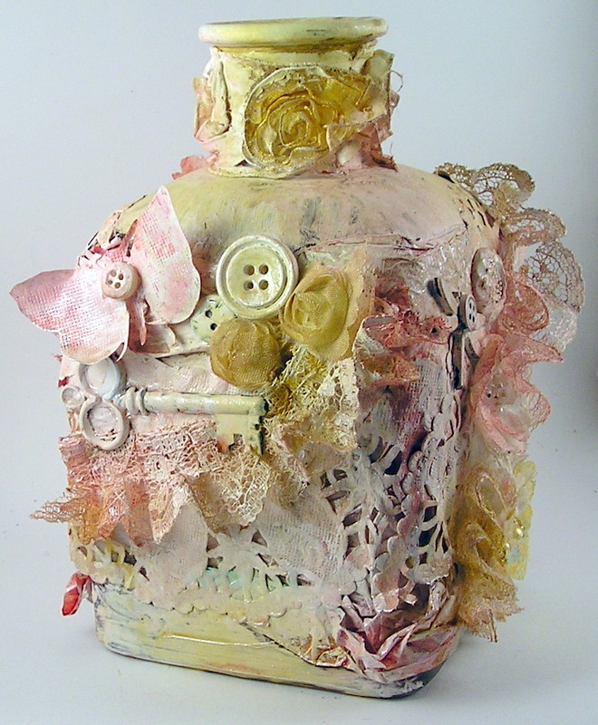
Suzz decided to up-cycle a vase and use some of her leftover bits and pieces to keep it green.
 I had this lovely glass vase that I have been wanting to up-cycle. I was thinking green and pulled out out my jar of buttons,leftover lace, and doilies to cover my shabby chic vase. I painted the entire surface using white acrylic paint. To add color I sprayed the surface with Tattered Angels Glimmer Mist Be Mine and Sun Sisters. I layered a mix of embellishments all painted white to coordinate. I included Tim Holtz Idea-ology Timepieces, 7 Gypsies 3 Key Charm Embellishments, Bo Bunny Medium Doily, and a little trimming.
Sandra Mouwen
I had this lovely glass vase that I have been wanting to up-cycle. I was thinking green and pulled out out my jar of buttons,leftover lace, and doilies to cover my shabby chic vase. I painted the entire surface using white acrylic paint. To add color I sprayed the surface with Tattered Angels Glimmer Mist Be Mine and Sun Sisters. I layered a mix of embellishments all painted white to coordinate. I included Tim Holtz Idea-ology Timepieces, 7 Gypsies 3 Key Charm Embellishments, Bo Bunny Medium Doily, and a little trimming.
Sandra Mouwen made a green birthday tag with die cuts made out of cereal boxes.
 I love to use old cereal or other food boxes for die cutting. It is really good cardboard, it's free and it's green because I recycle it. I have a big pile of ready to go recycled cardboard. For this tag I did, what I call the Metallic Marbled Stain technique, and used Evergreen Bough, Shabby Shutters and Brushed Pewter Distress Stain. In the background I stamped with my go to stamp Script from KaiserCraft and the number 3 with the Numero stamp set from 7Gypies.
Anna-Karin
I love to use old cereal or other food boxes for die cutting. It is really good cardboard, it's free and it's green because I recycle it. I have a big pile of ready to go recycled cardboard. For this tag I did, what I call the Metallic Marbled Stain technique, and used Evergreen Bough, Shabby Shutters and Brushed Pewter Distress Stain. In the background I stamped with my go to stamp Script from KaiserCraft and the number 3 with the Numero stamp set from 7Gypies.
Anna-Karin made a very green ruler binder tag book:
 When thinking about what to do this week, my eyes fell on Tim Holtz new Ruler Binder and I decided to make a tag book about my school years. I used almost only shades of green, with a little bit of kraft and gold. The tags were coloured with Distress Paint, inked and stamped, mainly with Stamper's Anonymous stamps and with four green Archival Inks. Tim Holtz rub-ons are perfect for small spaces and pages and I used them here and there. For a recycled detail, I die cut letters and numbers from clear packaging and coloured with alcohol inks.
This week
Dan was inspired by an article he'd read about the pressures on girls to conform to images in fashion magazines.
 I know, I know. It's a bit out there. I know exactly what you're thinking, but I pushed this one right out there because I was inspired by a serious topic and didn't want to pull my punches. This started out as a manilla tag, not that there's much evidence left of it. I cut the eye sockets out of the skull and replaced them with eyes from the Classics #5 stamp set and the mouth is Wendy Vecchi's Kiss Me stamp. Do you recognise the hair? It's repurposed from the David stamp in the Artful Artifacts set. I had a lot of fun trying the packing tape technique with the GelliArts printing plate and have included a panel of that here too. Oh yeah, one last thing...green. I used lots of green!
If that isn't enough inspiration for you - we also have TWO fabulous posts coming later this week!
Candy loves the lush greenery and beautiful fragrant flowers of summertime.
 I hope you will check back on Tuesday for a step by step tutorial on this "Good To Be Green" very vintage, very dimensional home décor piece that I created with you in mind.
Tracy
I hope you will check back on Tuesday for a step by step tutorial on this "Good To Be Green" very vintage, very dimensional home décor piece that I created with you in mind.
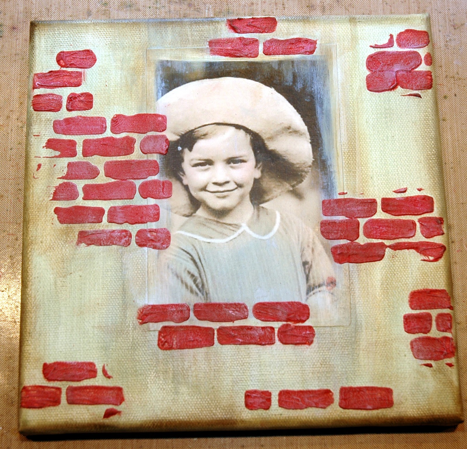
Tracy used a mix of recycled elements, paints and foliage in her canvas board.
 Pop back here on Thursday when I will have a few tips and ideas for creating my canvas and adding wonderful texture to your pieces. There will also be full step by steps for creating my canvas board on my blog.
For more inspiration click on our design team's blog links so you can see more photos (and full supply lists) for their projects.

As always,
Simon Says Stamp is giving away a $50 gift voucher that will go to a random entry chosen by Random Generator. To qualify all you need to do is create a new project that ties in (in any way!) with our theme and post it, along with a link back to this challenge, and add a link here. This challenge will end at 11:59pm on Sunday July 21 Eastern time.
We will also be choosing some of our entries to put in the spotlight - a special honor where we talk about why we loved that entry in particular and award a special badge too!
For the full rules, read the "challenge rules" posted in the side-bar here on our blog.


